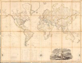
From CITY LAB: a new world map, Equal Earth
"[T]he world map most people know best is the Mercator projection. Designed in the 16th century by a Flemish geographer, it remains the most commonly seen cartographic presentation of the earth’s surface, reprinted in geography textbooks, scientific papers, and shower curtains the world over. And it is famously distorted: North America and Europe are exaggerated well beyond their true proportions, while Africa and South America are substantially shrunken."
"So the three master cartographers—Bernhard Jenny, an associate professor of visualization at Australia’s Monash University; Tom Patterson, a retired cartographer for the U.S. National Park Service; and Bojan Savric, a software engineer on Esri’s projection team—decided to make something better. For the next school district that decides to switch maps, or literally anybody else, their brand-new Equal Earth projection is now available" {quotes from CityLab, https://www.citylab.com/)
Here's a link to the new, free, downloadable map of the world:
 |
| An early 19th century view of the world, in the Mercator projection. (Library of Congress) |
Here's a link to the new, free, downloadable map of the world:


Comments
Post a Comment